Tuesday, 4 September 2012

Profile Magazine - final preview

After 4 long and undeniably stressful years my degree at The London College of Fashion has come to an end. My final project has been realised and created thanks to the helpful and efficient guys at The Bookbinders of London who turned my 2D InDesign vision into a 3D tactile product.
All of the work within the magazine was produced by myself including all written content, graphic design work and creative layout ideas which I am very proud of. 
Here are a few pages taken from Profile magazine's Lisa Watson feature. I am particularly happy with the Profile front page 'P' logo (which took me a very long time to do!) as it enabled me to visually represent my interest in the creative world of typography.


Sunday, 17 June 2012

Lisa Watson for Profile magazine


For my final degree project I have been working with talented and innovative jewellery designer, Lisa Watson throughout the process of her exciting final collection here at The London College of Fashion. 


Photography: Claire Masters:Fashion LDN


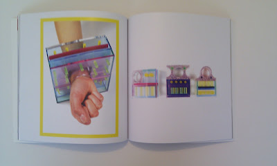
'Containment' is a collection of conceptual jewellery pieces heavily influenced by the world of post-modernist design and aesthetics. With their geometric angles, mathematically proportioned measurements and pop-art  inspired palette you would be forgiven for thinking that the designs created by Lisa Watson were intended for a gallery space rather than to be worn on the body. However, this final year jewellery design student has created a collection that is more then worthy of fitting quite comfortably into both the art and fashion environment. Her final year project on the BA (Hons) Jewellery Design degree here at The London College of Fashion reflects the ever increasingly evident link between fashion and other genres of design; in this instance, somewhat paradoxically, post-modernist architecture. Her eclectic designs encompass the ideology of design that derived from the depths of the Bauhaus in the early 20th Century and expanded into its own aesthetic movement that would influence all areas of design for generations to come.
Watson also draws inspiration from other architectural design styles; the Koz building in Saint-Cloud, Paris....


...30 St Mary Axe (more commonly known as the Gherkin building here in London) whose influence can be seen within the diamond etchings in her jewellery pieces...


...and even the old Italian cliff-top towns of Riomaggiore and Manarola.


The semi-opaque acrylic structures frame a series of etched-effect panels, miniature cylindrical pillars and layered 'floors' all designed to aesthetically represent the idea of a building not merely being a boxed vessel but a complex construction of geometrical shapes, lines and layers; all of which are usually hidden within the folds of a structure, often going unnoticed by the streams of by-passers. Yes, agreeably, the relationship between the worlds of architecture and jewellery appear to be paradoxical to one another but at the same time both principles of construction draw from similar aesthetics as is visually represented through these pieces.
Watson's designs are, on reflection, prototypes of buildings, the miniature models you see in the glass cases of an architects showroom. When photographed off the body and in a linear configuration they resemble a spectra of urban, post-modernist skyline. If one placed a Lisa Watson design on their coffee table it would share more resemblance to a piece of conceptual art.
Whilst not entirely practical or commercially wearable these designs represent the freedom of expression and experimentation that is nurtured and encouraged here at LCF. In allowing raw creativity to be expressed, in turn, creates a future of non-conformist and daring designers to emerge from the creative folds of our university.


www.showtime.arts.ac.uk/lisawatson


Creative Layout


As a creative magazine, I wanted to keep the layout fresh and current which meant avoiding generic magazine layouts such as standard content pages and being restricted to guided columns and margins.
A big source of inspiration for profile magazine layout was from Creative Review mag whose clever use of typography and page structure shows just how experimental you can be with a blank page.
Below is the "contents" page of my magazine set out in a "family-tree" style to deviate from the standard style used within many magazines. 


In terms of the page layouts, I really wanted to keep them as clean as possible. My aim was to avoid messy layering and unnecessary images. When I'm reading a magazine I am simply interested in the relevant images and the context of the writing and that they are visually cohesive. This is why I will not be using page numbers, master page layouts or recurring features; all of which tend to lead to generic page layouts. When I thought about it, how often do magazine readers actively use the page number/content reference? 
Whilst professional standard typography is essential in any magazine, particularly creative ones, I don't want to go to the extent of ensuring all lines of text are flush (see body text in the above layout, the staggered left-alignment of the text is intentional) or being restricted to such formal typographic rules. The main type features that I will be controlling throughout is the tracking (space between each individual letter) and leading (the vertical space between each line of type). 


As there are 3 very defined sections to my magazine which although linked by the common notion of "adornment" are quite paradoxical therefore I will need to explain my intentions for each section clearly through dividing articles which will lead from one section to the next. I will utilise my writing skills to lead the reader from one feature to the next through the use of dialogue (both body text and creative typography).


Profile Branding


As my degree project is a promotional platform for LCF students it is essential to also promote the concept of the idea as a brand in itself. The magazine will only work effectively on a collaborative basis therefore getting students excited and involved is essential. 
To begin building up the promotion of the brand I designed these canvas bags that become a walking advertisement for Profile magazine featuring my personally designed logo.


Bag printing: www.thecleverbaggers.co.uk 


Profile Magazine Intro


Profile magazine is the final project of my university degree at The London College of Fashion. It's aim is to profile and promote talented creatives within the university and to create an affiliation between the part-time and full-time degree focuses. Having studied on the part-time media degree for the past 4 years I have often felt isolated from the atmosphere of the university environment; we study during the evening and at weekends so rarely get to interact with full-time students. 

Profile magazine is a platform for interaction and whilst also being a tool for building up creative relationships is also beneficial for the students being 'profiled' by us. 

See it as a visual support network of creative minds...
The images shown here are the magazine's primary logos which visually contain the meaning and ideologies that sum up the focus of the project.

Sunday, 29 January 2012

Profile Magazine - The Concept

The concept has been presented and now to realise its creation. .Profile. magazine is the intended product of my final major project at The London College of Fashion; a collaborative and promotional magazine designed to represent the talent and creativity within the part-time degree program at the university. The aim is to showcase my work and the work of my peers within a visually stunning and thoughtfully written A3 magazine that will be distributed throughout the university. The following pages form the basis of my proposal and uses personal photography, illustration and written dialogue all created using Adobe InDesign to present my final major project idea.


Saturday, 19 November 2011

Fine Artistry - Tattoos and the female form


So, it's final major project time at The London College of Fashion and after 3 long, sleep deprived years of studying the finishing line is finally within sight. Having said that the next year is possibly going to be the most stressful of them all, especially as the f.m.p brief is completely open to each student's personal choice and imagination!

Throughout my fashion communication media degree I have always been particularly drawn to the ideologies of the feminine form within our western culture and how a woman's physical appearance contributes to the way they are perceived in society. From the routine practice of wearing make-up, piercings and tattoos, the class connotations linked to diamonds and jewellery and the extremes of body modification; for centuries women have been manipulating and enhancing their bodies but for what purpose? Surely not solely for the purpose of attracting the opposite sex? This is what I intend to research, challenge and study for my chosen final project compiled in the form of a self-created fashion culture magazine using commissioned and personally written articles, in-depth interviews, visually rich photo shoots and collaborative work featuring other creative students within The University of the Arts, London.

I have begun my research by looking at the art of body art and tattooing. I myself have a couple of tattoos and I am also lucky to have a few friends at university who's bodies have been turned into walking canvasses! The perfect source of inspiration and research. I am collecting my research visually through photography and drawing so here are a few taster images courtesy of a couple of willing uni friends! Thanks Kerry and Charlotte x